Styling
This part of customising campaign form involves changing the color and orientation of a created campaign form to match your company's brand color and style.
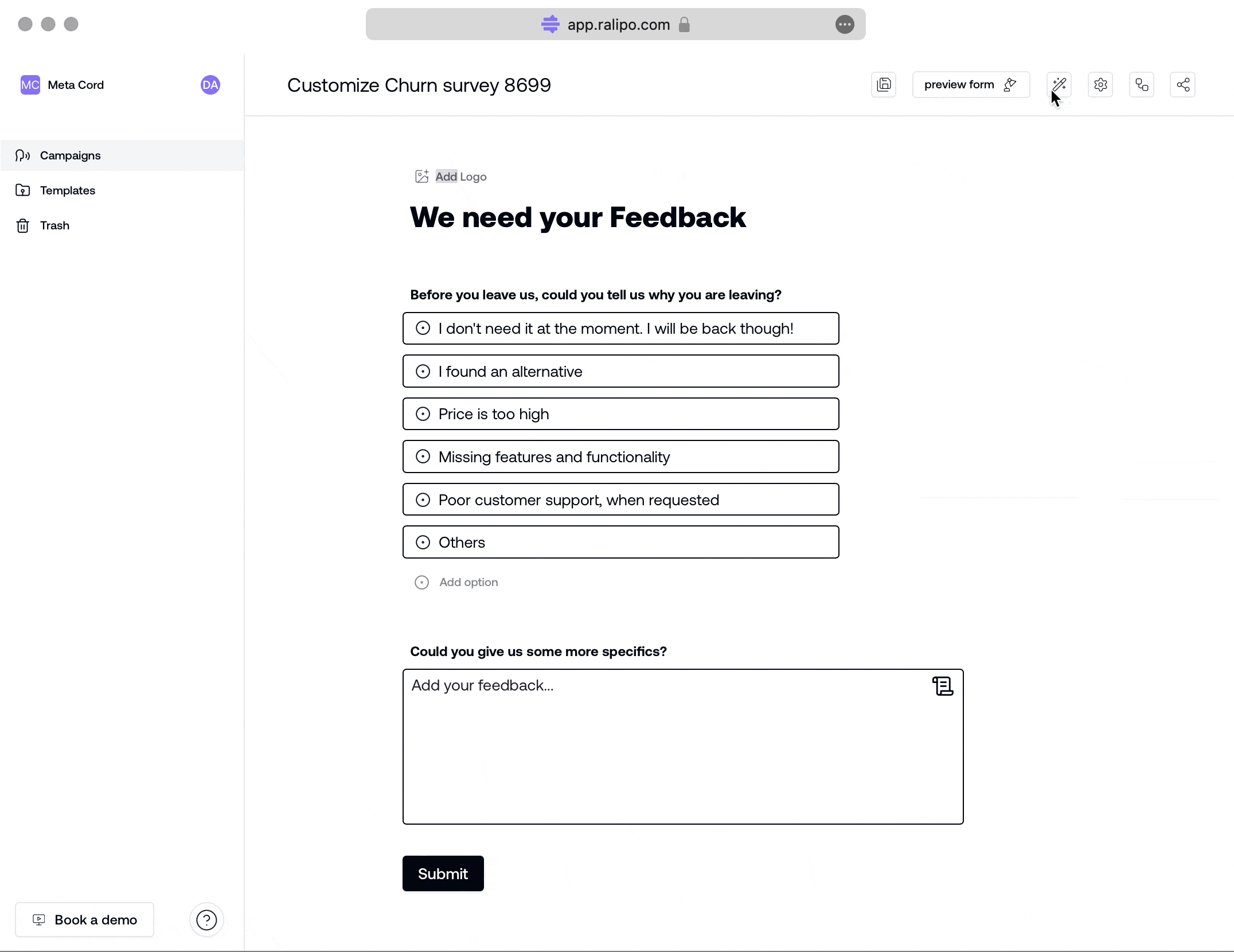
To make these changes while editing the form, Click on the edit pencil button at the top-right corner of the edit campaign form page.
On clicking the pencil icon, a side modal opens on the right with displays all properties that can be styled.
There are three major parts to style on a campaign form:
- Body
- Header
- Button
Body
The Body of the Feedback campaign form encompases the entire form page. Here, customisations for both background and text is applied to the content on the canvas (asides the header content).
For the body, you can customise the text color for all content blocks, titles/labels and the body background. To make this change:
- Select
backgroundtext - Click on your choice color or type in your preferred color code
The color codes is represented in a hex code system like
#ffffff#9a7e7e#030712
Heading
The Campaign form heading, positioned at the top, provides context for the purpose and content of the form. A glance at the campaign form header assists your users in understanding the form's purpose and intended audience. The Heading consist of a Text and a Logo Block.
Text Block: For the text block you can simply customise the text color and the background color by selecting the field and selecting your choice color to customise with.Logo Block: The Logo block takes the background color applied to the overall header and has no main styling applied to it.
Button
The Button component on the campaign form allows styling for text and button background. Here you can:
- Change text color with
Button text - Change button backgroud with
Button background - Extend the width of the button using
Button full width